题目内容
6.Graphs can be a very useful tool for conveying information,especially numbers,percentages,and other data.A graph gives the reader a picture to interpret.That can be more efficient than pages and pages explaining the data.Graphs can seem frightening,but reading a graph is a lot like reading a story.The graph has a title,a main idea,and supporting details.You can use your active reading skills to analyze and understand graphs like any other text.
Most graphs have a few basic parts:a caption or introduction paragraph,a title,a legend or key,and labeled axes.An active reader looks at each part of the graph before trying to interpret the data.Captions will usually tell you where the data from (for example,a scientific study of 400 African elephants from 1980 to 2005).Captions usually summarize the author's main point as well.The title is very important.It tells you the main idea of the graph by stating what kind of information is being shown.A legend,also called a key,is a guide to the symbols and colors used in the graph.Many graphs,including bar graphs and line graphs,have two axes that form a corner.Usually these axes are the left side and the bottom of the graph.Each axis will always have a label tells you what each axis measures.
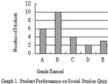
| Bar Graphs A bar graph has two axes and uses bars to show amounts.In Graph 1,we see that the x-axis shows grades students earned,and the y-axis shows how many students earned each grade.You can see that 6 students earned an A because the bar for A stretches up to 6 on the vertical measurement.There is a lot of information we can get from a simple graph like this (See Graph 1) |  |
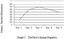
| Line Graphs A line graph looks similar to a bar graph,but instead of bars,it plots points and connects them with a line.It has the same parts as a bar graph---two labeled axes---and can be read the same way.To read a line graph,it's important to focus on the points of intersection rather than the line segments between the points.This type of graph is most commonly used to show how something changes over time.Here is a graph that charts how far a bird flies during the first five days of its spring migration (See Graph 2). |  |
Pie Graphs
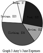
A typical pie graph looks like a circular pie.The circle is divided into sections,and each section represents a fraction of the data.The graph is commonly used to show percentages; the whole pie represents 100 percent,so each piece is a fraction of the whole.A pie graph might include a legend,or it might use icons or labels within each slice.This pie graph shows one month's expenses(See Graph 3).
Food 25 Movies12 Clothing 36Savings20 Books $7

45.When used in a graph,a legend isA.
A.a guide to the symbols and colors
B.an introduction paragraph
C.the main idea
D.the data
46.What is the total number of students who earned a C or better?D
A.4.
B.6.
C.10.
D.20.
47.The bird covered the longest distance onC.
A.Day 1.
B.Day 2.
C.Day 3.
D.Day 4.
48.Which of the following cost Amy most?D
A.Food.
B.Books.
C.Movies.
D.Clothing.
分析 这是一篇说明文,介绍图表的类型以及其相关作用,通过对条形图、线形图和饼形图的介绍,让学生学会读图,运用英语解决实际问题.
解答 45.A,细节理解题,根据句子A legend,also called a key,is a guide to the symbols and colors used in the graph.可知,一个图例是一个在指导图中使用的符号和颜色,故答案为A.
46.D,细节理解题,根据表述In Graph 1,we see that the x-axis shows grades students earned,and the y-axis shows how many students earned each grade.You can see that 6 students earned an A because the bar for A stretches up to 6 on the vertical measurement以及根据图可知,A为6个,B为10个,C为4个,故答案为20.
47.C,细节理解题,由线形图可知,最高点出现在第三天,为70km,故答案为C.
48.D,细节理解题,由饼形图可知,面积最大的是Clothing,故答案为D.
点评 解答任务型阅读理解题,首先对原文材料迅速浏览,掌握全文的主旨大意.因为阅读理解题一般没有标题,所以,速读全文,抓住中心主旨很有必要,在速读的过程中,应尽可能多地捕获信息材料.其次,细读题材,各个击破.掌握全文的大意之后,细细阅读每篇材料后的问题,弄清每题要求后,带着问题,再回到原文中去寻找、捕获有关信息.最后,要善于抓住每段的主题句,阅读时,要有较强的针对性.对于捕获到的信息,要做认真分析,仔细推敲,理解透彻,只有这样,针对题目要求,才能做到稳、准.

 阅读快车系列答案