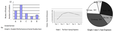
题目内容

5.When asked to explain _____ he did to make his students so fascinated with his lessons,the teacher paused and thought deeply.(  )
A.what was it thatB.that what it was
C.what it was thatD.what was it

分析 句意:当被要求解释他做了什么让学生对他的课这么着迷的时候,这个老师停下来沉思.

解答 答案:C.强调句的特殊问句结构是:特殊疑问词+is/was+it+that+其余部分.这里的强调句是做explain的宾语从句,所以语序应该用是陈述语序,故选C.

点评 考查强调句的特殊问句做宾语从句的用法.做强调句型这类题型时,关键是要会判断.it is/was+被强调部分+that/who+…判断方法是去掉it is/was  that/who句子不缺成分,即为强调句型.还要熟记强调句的特殊问句和一般问句,再者注意强调句的特殊问句做宾语从句时须用陈述语序.

练习册系列答案
相关题目
2.Graphs can be a very useful tool for conveying information,especially numbers,percentages,and other data.A graph gives the reader a picture to interpret.That can be a lot more efficient than pages and pages explaining the data.
Graphs can seem frightening,but reading a graph is a lot like reading a story.The graph has a title,a main idea,and supporting details.You can use your active reading skills to analyze and understand graphs just like any other text.
Most graphs have a few basic parts:a caption or introduction paragraph,a title,a legend or key,and labeled axes.An active reader looks at each part of the graph before trying to interpret the data.Captions will usually tell you where the data from(for example,a scientific study of 400African elephants from 1980to 2005).Captions usually summarize the author's main point as well.The title is very important.It tells you the main idea of the graph by stating what kind of information is being shown.A legend,also called a key,is a guide to the symbols and colors used in the graph.Many graphs,including bar graphs and line graphs,have two axes that form a corner.Usually these axes are the left side and the bottom of the graph.Each axis will always have a label tells you what each axis measures.
Bar Graphs
A bar graph has two axes and uses bars to show  amounts.In Graph 1,we see that the x-axis showsgrades students earned,and the y-axis shows how many students earned each grade.You can see that 6students  earned an A because the bar for A stretches up to 6on the vertical measurement.There is a lot of information we can get from a simple graph like this (See Graph 1)
Line Graphs
A line graph looks similar to a bar graph,but instead ofbars,it plots points and connects them with a line.It has thesame parts as a bar graph---two labeled axes---and can be read the same way.To read a line graph,it's important to focus on the points of intersection rather than the line segments between the points.This type of graph is most commonly used to show howsomething changes over time.Here is a graph that charts howfar a bird flies during the first five days of its spring migration
(See Graph 2).
The unit of measurement for the x-axis is days.The unit of measurement for the y-axis is kilometers.Thuswe can see that,on the first day,the pipit flew 20kilometers.The line segment goes up between Day 1and Day 2,which means that the bird flew farther on Day 2.If the line segment angled down,as between Day 4and Day 5,it would mean that the bird flew fewer kilometers than the day before.This line graph is a quick,visual way to tell the reader about the bird's migration.
Pie Graphs
A typical pie graph looks like a circular pie.The circle is divided intosections,and each section represents a fraction of the data.The graph iscommonly used to show percentages; the whole pie represents 100percent,so each piece is a fraction of the whole.
A pie graph might include a legend,or it might use icons or labels within each slice.This pie graph shows one month's expenses(See Graph 3).
Food 25Movies12
Clothing 36Savings20
Books $7


46.When used in a graph,a legend isA.
A.a guide to the symbols and colors
B.an introduction paragraph
C.the main idea
D.the data
47.What is the total number of students who earned a C or better?D
A.4.    B.6.    C.10.    D.20.
48.The bird covered the longest distance onC.
A.Day 1.   B.Day 2.    C.Day 3.       D.Day 4.
49.Which of the following cost Amy most?D
A.Food.   B.Books.    C.Movies.     D.Clothing.

违法和不良信息举报电话:027-86699610 举报邮箱:58377363@163.com

精英家教网