题目内容
Last year, some groups of students in their community made a survey about “How do people spend their free time?” The following diagrams show some results of it:
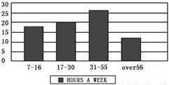
Diagram (1): Hours for people of different ages who surf the Internet in a week.
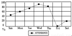
Diagram (2): Different days people go to the library. ( library attendance )
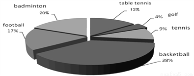
Diagram (3): Different sports people like.
D (1) D(2)

 D (3)
D (3)

1.People aged spend the most time surfing the Internet every week.
A. 7~16 B. 17~30 C. 31~55 D. over 56
2.The word “attendance” in Diagram (2) means “ in the library”.
A. the hours people spend B. the number of people
C. the number of books D. the days people spend
3.How many people go to the library on Saturdays?
A. About 20%. B. About 40%.
C. Over 60%. D. More than 80%.
4.Which of the following is TRUE according to the diagrams?
A. The fewest people like playing tennis.
B. Football is the most people’s favorite sport.
C. People seldom go to the library on weekdays.
D. The most people like playing basketball.
5.The three diagrams show us the results of a survey about .
A. what people do every day B. people’s different habits
C. people’s different lifestyles D. how people spend their free time
1.C 2.B 3.A 4.D 5.D 【解析】本文介绍了一些学生对“人们如何度过业余时间”的调查结果。 1.C 推理判断题。根据Diagram (1)柱形图里展示的内容,31~55岁的人一周内上网的时间最长,故选C。 2.B 推理判断题。根据Diagram (2): Different days people go to the librar... 孟建平错题本系列答案
 超能学典应用题题卡系列答案


 Linda: Once, when I was on my way back to my hometown, I lost my purse without even knowing it. I was told over the train’s loudspeaker that my purse was at the railway station's lost and found office. But the train had already started. Seeing my helplessness, a kind hostess offered to lend me some money. I went back to the railway station and got my purse. I am still thankful to the railway staff and the person who found my purse.
 Scott: When I was a little boy, there was a time when I went to fish with my elder sister. All of a sudden, I slipped into the river. The next thing I remember is my father holding me in the hospital. Today I still don’t know who got me out of that river. I have been trying to help other people whenever I can all these years.
 waste. Our other neighbors don't like his behavior. But in my opinion, it's his way to support his family. Once, after cleaning my house, I placed some cardboard boxes in his garden and left my rubbish beside my door. However, when I was about to go out, I found nothing outside my door but a note: "I have thrown away your rubbish. You are a nice girl. Thanks a lot!"